Improving a complex and powerful CRM to increase sales and demo conversions.
AllClients CRM software is an all-in-one, integrated online contact management solution aimed for small businesses.
Context
AllClients is a versatile and complex CRM software sold directly to end users but mainly through partners and resellers.
The software is highly configurable which enables partners to whitelabel the software across a wide range of industry sectors. This also represents a challenge in terms of providing a consistent look and feel and default configurations for new accounts.
One of the key sales objection was that the software feels dated and it is perceived as one of the main reasons why prospects may not buy it.
Goal
The goal of this project was to improve the look and feel of the software whilst also making some improvements to the user experience. As an outcome we were expecting to increase sales and conversions on demos.
The software has been in operation for 16 years. Therefore this project also provided an opportunity to revisit previous design decisions and make improvements across the UX, from navigation to feature sets and software architecture.
This project was done while working for UserActive.
“Instead of just coming up with great designs, they prompted us to go through the process of asking why is the user doing this, why are they seeing that, etc. and helped us think through some more things that we would never thought.”
Process
Facilitating a Design Thinking workshop was the first step on this project, where we establish desired outcomes from the start. This allowed us to take the client into a journey to better understand their customer needs and agree on a plan of action that could deliver the most value.
In way to increase sales and demo conversions, we agreed to focus on improving three key areas of the software:
Global Navigation;
Dashboard;
Contact card.
Navigation
While restructuring the navigation we wanted to showcase the product in its best light.
We used a mind-mapping tool to explore the new navigation structure and iterated on this until we found a consensus with the client.
The design for the new navigation focused on providing more context regarding the different software tools, and increasing its discoverability.
Dashboard
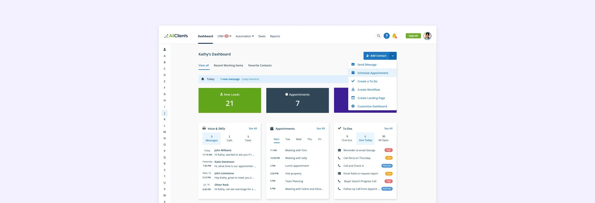
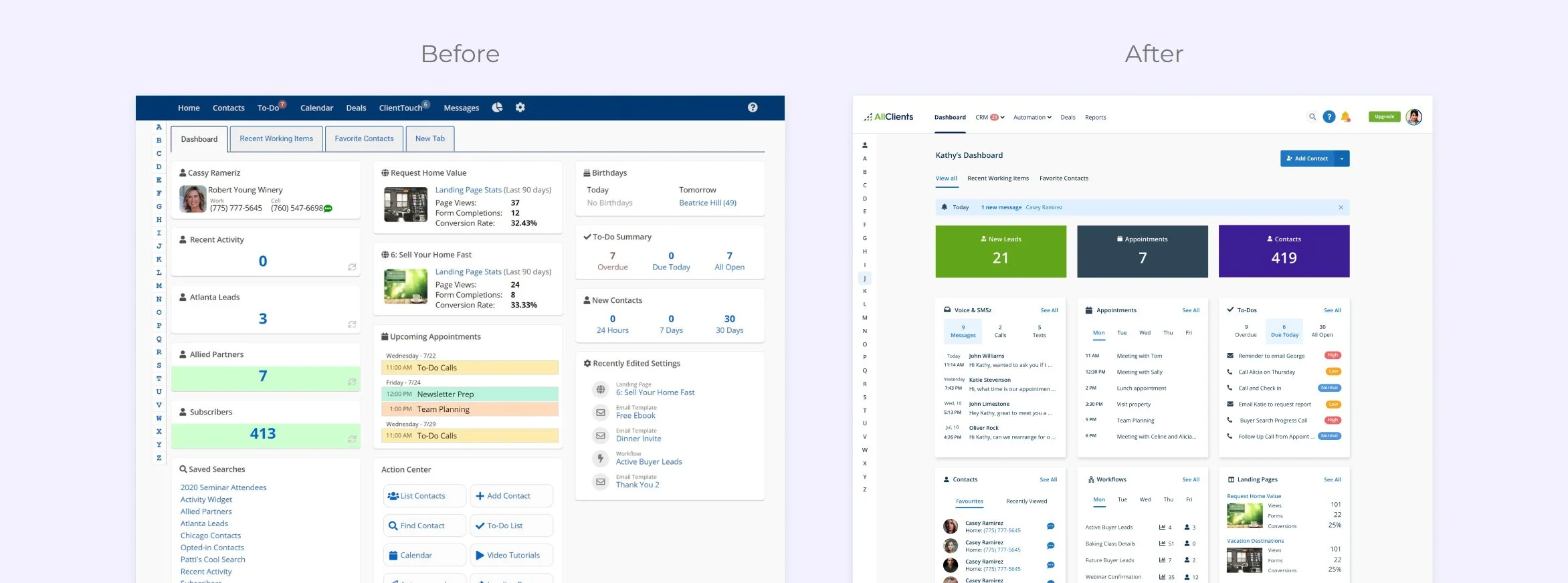
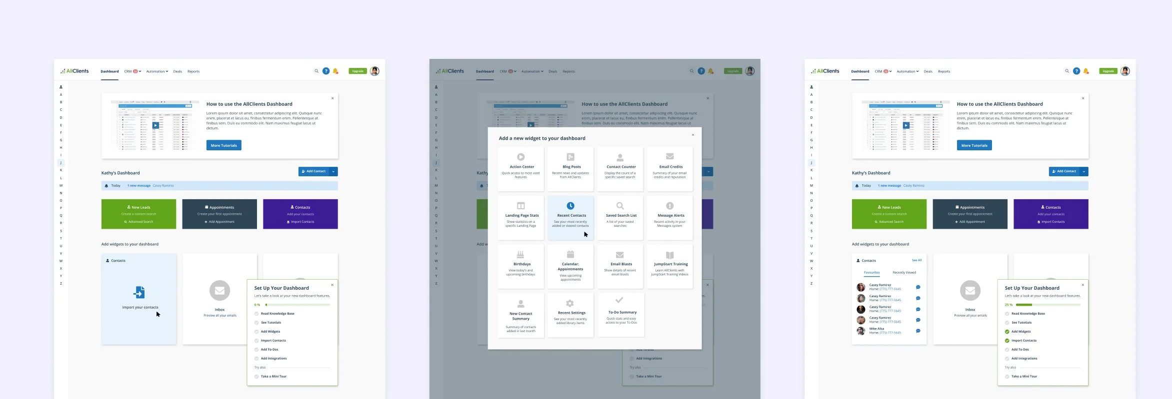
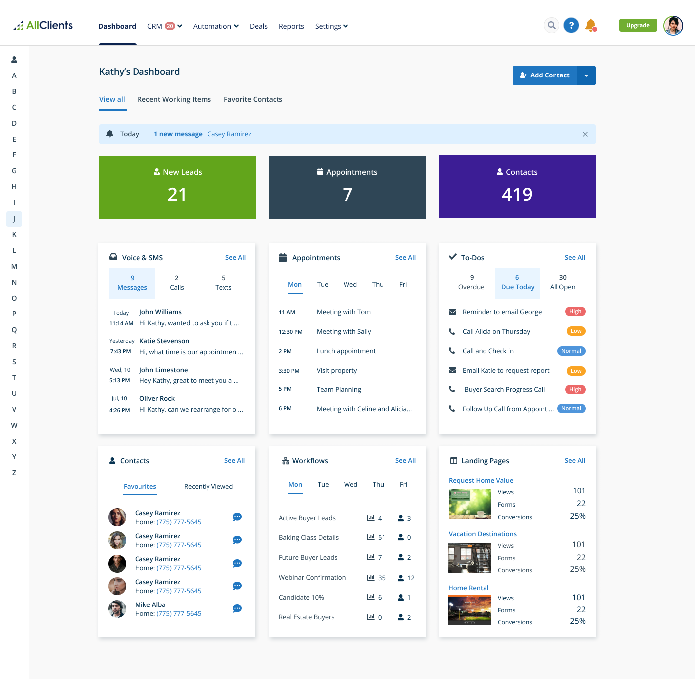
Since we consider the dashboard an overview of the user account, we wanted to make sure this page was a true reflection of the most important features in the software.
On this design we pulled out three widgets for stats, showing the most important features at the top. Then, we’ve listed the remaining widgets in a grid layout and redesigned each one of them to increase readability and acessibility.
Contact Card
We also put some effort into re-organising AllClients contact card information to make it more intuitive and easier to use.
This screen was considered one of the most important because it’s used regularly when sales representatives are in touch with prospects and need to perform quick tasks on the fly, such as: take notes, schedule appointments, manage tasks or setup automations.
Settings
Another problem that needed to be addressed was the settings screen. Over time, plenty of valuable features had been dropped in this area without any particular consideration. This made some features difficult to discover for users. We saw this as a big opportunity to bring these features to the forefront of the software, by organising them in different groups and providing some contextual information.
Design Consistency
The product website, served as a reference in terms of color and typography because that's often the first touchpoint for users. With careful consideration, we incorporated some of the brand elements into the new designs while still maintaining a clean and modern UI.
At the end of this project, we have put together a UI Style Guide for future development and design use. This kit included key software components, treatments such as hover states and text field elements, and guidance regarding color scheme usage and typography.


